Friday, 2 May 2014

Final Polish and the Flythrough

Last week weve spent adding the finishing touches for our flythrough and hand in.

I spent the last week finishing off some decals – more graffiti and posters. I created some puddles to add more ground variation as well as to show off the reflections more.

We also wanted to get more movement in the skyline.  So I took some parts of my old vehicle project from a few months back to kit bash together 3 different basic ship silhouettes. I tweaked the texture maps to get a nice glow effect on the thrusters.  Each ship was animated to “fly” forward at different speeds according to their size i.e. the bigger cargo ships moved at a much slower speed than the small speeders, this gave nice speed variation.  These were all imported into cry facing different directions. We found adding in all these flying ships added so much character to the level and really made the city feel alive and futuristic.

I also spent last week getting the rotating billboard working. I had a lot of trouble with this a month before trying to get it to work within cry, the animations would not appear within cry. After a lot of trial and error I found out that I couldn’t animate individual vertices of an object – I could only animate the whole object. So what I had to do in the end was separate each rotating strip, then animate them  to turn 180*, then export to cry. I had to do this for all 16 individual strips which make up the billboard. After they were all imported into cry I then had to line them up in the correct order. Even though I spent a good 4 days over month trying to get this to work we are happy that I did, as it adds more to the visual aesthetics.

Me and Luc also produced several particle effects for the level – fire, smoke, steam, sparks and ambient smoke. These added a lot of character to the environment especially the ambient smoke.

Luc also spent the last week getting his old vehicle project in (the mech) which adds to that extra heavy police presence feeling, as well as providing enough way of blocking off an area. He also spent a good while nailing the colour grading. We spoke to our tutor who showed us a technique to omit value from a picture so it only shows pure colour within photoshop. We used this technique on a few stills from films such as Blade Runner and Drive to get an idea on how they used colour to push the scene/composition. Using this technique made us relise that we had a lot of strong colours fighting against each other. So when it came to the colour grading we tried to mute these colours slightly so we could have a more uniform colour across the picture.

After a few tweaks and some last level building we were ready to start our flythrough. We put together some small, but nice compositional shots to show off the best parts of the level. We overlaid some fitting music to produce the best results.

Stills:


Flythrough:


Thursday, 24 April 2014

Final Push

These last two weeks we've focused on finishing up stuff that got pushed back, namely the monorail and animation, and the city behind the wall.

I started off by drawing up some designs for the buildings for Dan to model


I mainly focused on internal and external silhouette, because these would be at a distance you'd never seen any great detail other than the outer silhouette and the internal shapes from the glowing lights


The buildings in engine brought up a few problems, because of their scale and distance from the players view, the global fog mostly drowned out any detail they had, so to counter this I've had to place large ambient lights near the buildings with very high intensity diffuse settings. The only problem is, because of the rains glossines, it's creating quite a harsh purple reflection on a lot of the assets near the wall. I've done the best I could to strike a balance and don't think it's horribly noticable.

Monorail Car

We also have a working animated monorail! Dan and I teamed up on this to speed things up, after I laid out the initial track pieces scale for the animation tests a while back, he took these and finalised them along with the struts, giving me time to work up a quick design for the monorail and then model, texture and animate it myself and bring it into engine.

Because Cryengine doesn't accept anything other than TCB contstraints, and I was trying to animate along path constraints, I had to bake out the animation in max and import to another file which I could then export to Cryengine.

We're now focusing on tweaks and polish, adding decals, particles and as much clutter as we can to the level.

However I did start experiencing heavy framerate drops this week which was worrying. I've had to go round and at least half the texture size of all my assetts, and Dan will probably have to do the same with his. There's barely a difference in texture quality change and the framerate has risen which is all good, though I'm worried excess particles may bring it down again.


I still feel like there's a lot we could do with the lighting and atmosphere, so we'll spend some time on that this remaining week.

Saturday, 12 April 2014

Improvements, improvements everywhere.

This last week and a bit has seen some small, but major improvements in our level.

Last Friday (4th April) we had our last assessment with our tutors before our final hand in. We got some great feedback for the level. The main criticism we got was the lighting needed to be pushed further, to get more contrast between light and dark areas, as well as increasing depth. After that we sat down with one of the tutors and tweaked the lighting towards the right direction. We brought down the ambient light to almost zero, so all the light sources are from local lights and holograms. Doing this also improved the light reflections from the puddles, which adds so much more atmosphere. Below shows the before and after shots for these lighting changes:

Before

After

Before

After

Before

After

Using Google maps to see how the streets of the ‘City of God’ in Rio actually look gave us a good indication of how much varied clutter there is in the streets, which we want to reflect in our level. So we came up another set of props for both of us to tackle. After producing them we started to litter the streets with them, which started to add so much more character to the level.

Litter
We feel like we have most of the final level done, we just have to move onto polishing and adding those little touches which add a lot to the environment. One of those major things is movement. I've spent a few days getting an oscillating camera working which we are placing around the level a lot to really sell the big brother vibe. I got tarps and clotheslines blowing in the wind, which was a bit tricky to get working realistically, but with the help of vertex painting I solved that issue

Tarps and Clotheslines moving

Cameras
We also came up with a way to add a bit more life to our holograms by making them look broken. We did this by duplicating the hologram model and placing it slightly in front of the original hologram. Then we created a new material for it where we played with the oscillating and colour settings giving us a nice broken hologram effect.


Both of us have been building out the level more as well as blocking of areas from the player in a realistic way.

Monday, 31 March 2014

Propper Jobs

This week Dan and I have been busting out all the props, amongst other things. We've got a lot to get through, but we're about halfway through the list we set ourselves last week.

I spent some time tweaking the mood and lighting of the level last week to better suit our vision of a grimey, wet looking city. I also added in placeholder cityblocks either side of the wall which REALLY helps sell the scale of the place already, they are very overbearing and it feels like a city already.

City blocks, before lighting tweaks

Added raised highways, fog and a nice wet sheen
Bin designs to push the futurism a little

Starting to litter the area


We're kinda of tweaking the lighting as we go at the moment. There are definitely areas and elements that are suffering at the moment, (that tree looks horribly green in the courtyard) and we'll have to do multiple passes and make sure the lighting suits the composition of elements in the scene and leads the player around the level nicely.


Cryengine's hologram shader does a nice job for the futuristic advertisements. I've also made some animated textures for the pulsating glow on certain props, which could be applied to ads and tv broadcasts with scrolling text.

Next up, more props and signs! And hopefully an animated monorail...

Tuesday, 25 March 2014

Level Building

Since our last update we have started to slowly replace the original white box with designer boxes. These designer boxes were original planned to be used as a base so we could import the designer buildings back into max to make the final buildings. But due to a bug in cry we couldn’t export the designer buildings, so we’ve made the decision to make these buildings purely in designer. While this has made things difficult as we can’t use vertex painting to blend between 2 different textures, it’s has allowed us to build the level very quickly and because we have a lot of modular models to break up the textures it has worked out surprisingly well. Using these designer buildings as bases we used all of our props and modular assets to start building loads of unique buildings.


To make building the level as efficient as possible between the 2 of us we started to use the layer system in cry. We did have a few problems at the start of the project when trying to use the layer system with models and textures showing for one person but not the other, but we resolved it by making sure we had the same file directories.


We have a layer each to work on which relates to a certain part of the level which we are responsible for creating. Luc is focusing on the courtyard area, while I’m focusing on the commercial/police area. This has allowed us to produce the level very quickly.

As we started to build up the level we felt some small things we’re missing which would give us a lot of atmosphere. So to get a better idea of things we started to use cry engines default models, such as particle effects, water effects and vegetation.


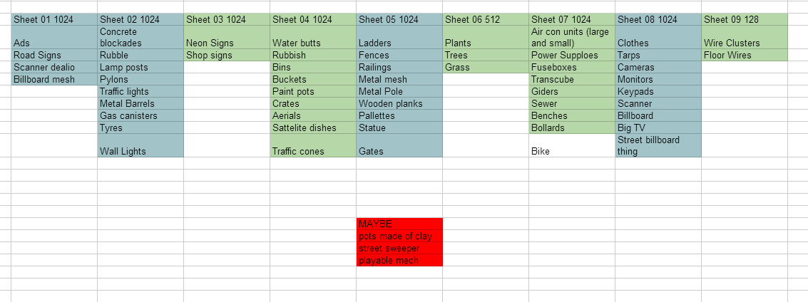
We are moving onto the props this week, so we can’t start adding in the much needed character for the level. We have come up with prop list and divided what props which are doing:


Monday, 10 March 2014

Attack of the Shacks

The past two weeks we've focused on getting more large pieces finalised and in engine. We decided to go back and block out the bigger forms in cryengine, as the whitebox we initially used was one big mesh imported from max, we couldn't move things around and change scales of objects.
The modular sci fi assets are done. Some prefab buildings have been made ready to populate the levels.


 We've since decided to scrap the playable sewer area because it felt unnecessary, and also due to time, but will still keep the sewer pipe spewing out waste into the slums

I gathered some more ref to get a better feel for how the streets feel at eye level.


Dan's road is in place, making the level look 100x better already.

He also made a new cinderblock texture that resembles the brickwork in the Rio slums more.

 I've been working on a series of favelas to be placed around the sewer/low end areas, and using the blend layer system in cryengine we get a really nice worn plaster look using vertex paint modifiers.

Quick blockout of the monorail system above. The next stage is trying to get the path constraint animation that the monorail car follows into Cryengine, which has proved difficult because Cry only accepts TCB controllers
I've drawn up a quick sketch of the wall and am in the process of texturing